8. The allele frequency spectrum#
Consider the following autosomal genotype table for five diploid individuals:
| 29 | 200 | 325 | 428 | 455 | 698 | individual |
|---|---|---|---|---|---|---|
| T/T | T/T | G/G | C/T | G/T | C/C | 1 |
| T/T | T/T | G/G | T/T | T/T | C/A | 2 |
| T/G | T/G | G/T | T/C | T/T | C/C | 3 |
| T/T | T/T | G/G | T/T | T/T | C/C | 4 |
| T/T | T/T | G/G | T/T | T/T | C/C | 5 |
The numbers refer to positions in the genome where there is variation in DNA sequence.
8.1. Common data encodings#
8.1.1. Ancestral vs derived alleles#
If we know that the ancestral state at each position is:
| 29 | 200 | 325 | 428 | 455 | 698 |
|---|---|---|---|---|---|
| T | G | G | C | T | C |
Then, we can rewrite our variation table using 0 to represent the ancestral state and 1 for the derived state:
| 29 | 200 | 325 | 428 | 455 | 698 | individual |
|---|---|---|---|---|---|---|
| 0/0 | 1/1 | 0/0 | 0/1 | 1/0 | 0/0 | 1 |
| 0/0 | 1/1 | 0/0 | 1/1 | 0/0 | 0/1 | 2 |
| 0/1 | 1/0 | 0/1 | 1/0 | 0/0 | 0/0 | 3 |
| 0/0 | 1/1 | 0/0 | 1/1 | 0/0 | 0/0 | 4 |
| 0/0 | 1/1 | 0/0 | 1/1 | 0/0 | 0/0 | 5 |
8.1.2. Minor vs major alleles#
For positions with two alleles, one is more common and the other more rare.
We call the rarer allele the minor allele.
The following table encodes our data such that 1 is the minor allele and 0 is the more common, or “major” allele:
| 29 | 200 | 325 | 428 | 455 | 698 | individual |
|---|---|---|---|---|---|---|
| 0/0 | 0/0 | 0/0 | 1/0 | 1/0 | 0/0 | 1 |
| 0/0 | 0/0 | 0/0 | 0/0 | 0/0 | 0/1 | 2 |
| 0/1 | 0/1 | 0/1 | 0/1 | 0/0 | 0/0 | 3 |
| 0/0 | 0/0 | 0/0 | 0/0 | 0/0 | 0/0 | 4 |
| 0/0 | 0/0 | 0/0 | 0/0 | 0/0 | 0/0 | 5 |
8.2. Tabulating allele counts (and frequencies)#
8.2.1. Derived alleles#
At each position, we obtain the number of occurrences of the derived allele by simply counting the number of times the value 1 appears in each column from the table shown in Section 8.1.1:
| 29 | 200 | 325 | 428 | 455 | 698 |
|---|---|---|---|---|---|
| 1 | 9 | 1 | 8 | 1 | 1 |
8.2.2. Minor alleles#
We can do the same exercise with respect to the minor allele by using the table from Section 8.1.2:
| 29 | 200 | 325 | 428 | 455 | 698 |
|---|---|---|---|---|---|
| 1 | 1 | 1 | 2 | 1 | 1 |
8.2.3. From counts to frequencies#
The previous two sections give us counts of how many times a derived or minor allele occurs in the sample. To get the frequency of the allele, simply divide by the number of genomes in the sample. For the examples here, variant tables refer to autosomal diploid genotypes. Therefore, the number of genomes sampled is twice the number of individuals in the tables.
8.2.4. Tabulating allele counts (and frequencies) into the “allele frequency spectrum”#
The tables in the preceding section show us how many times the derived (or minor) allele appears at each position.
In this section we ask, “how many positions are there with a derived/minor allele at frequency \(x\)?”. In other words, how many positions are there with the derived mutation at frequency 1, 2, etc.?
8.2.5. Derived alleles#
From the count table above, we can tabulate:
| 1 | 8 | 9 |
|---|---|---|
| 4 | 1 | 1 |
This table tells is that there are four positions in our data where the derived allele is present in a single sample. There is one position where the derived allele appears in 8 samples. There is one position where the derived allele appears in 9 samples.
This table called the allele frequency spectrum. We usually present it graphically (Fig. 8.1).
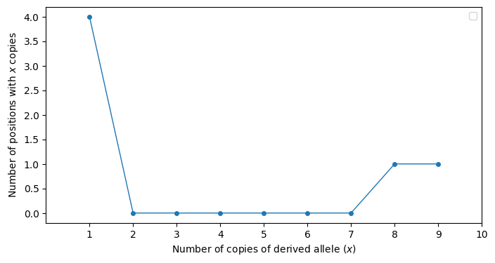
Fig. 8.1 An example of the “allele frequency spectrum” for data where the derived allele is known. The x axis is the count, or number of occurrences in the sample of the derived allele at a given position in the genome. The y axis is the number of genomic positions that have the same x axis value.#
8.2.6. Minor alleles#
Fig. 8.2 shows the allele frequency spectrum for the same data with respect to the minor allele count.
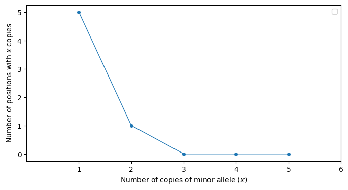
Fig. 8.2 An example of the “allele frequency spectrum” of the minor allele. The x axis is the count, or number of occurrences in the sample of the minor allele at a given position in the genome. The y axis is the number of genomic positions that have the same x axis value.#
Attention
Test yourself!
Make the table representation that corresponds to Fig. 8.2. (For inspiration, see the table shown for derived allele counts in Section 8.2.5.)
8.3. Why the “allele frequency spectrum” is useful#
Different evolutionary scenarios make different predictions about the shape of the frequency spectrum.
We can compare our observed spectrum to what theory predicts about a given model to ask if our data seem plausible under that model.
And/or we can fit (infer) the parameters of the model using our observed frequency spectrum. Fig. 6.1 is an example of fitting parameters to a demography model from frequency spectrum data. The frequency spectrum in that figure is a bit more complex, keeping track of mutation counts in all of the modern day sample populations.
8.4. Notes, gotchas, etc., about the “allele frequency spectrum”#
The nomenclature is poor. We call it a “frequency” spectrum but we are plotting counts.
This way to summarize the data has a few synonyms. “Site frequency spectrum” is probably the most common.
For the derived frequency spectrum, the range of the x axis is from 1 to \(n-1\), where \(n\) is the total number of genomes in the sample.
For the minor allele frequency spectrum, the range of the x axis is from 1 to \(n/2\), where \(n\) is the total number of genomes in the sample.
If the variation table from which a frequency is obtained is from biased data, then the plot may not look like what one predicts from first principles. For example, much of our theory assumes that we completely sequence a set of unrelated genomes. However, if we genotype a set of unrelated genomes at a set of positions that we already know are variable in the population, then the frequency spectrum shape will be affected!! Therefore the provenance of the data is critical to interpreting the plots.